Music album packaging
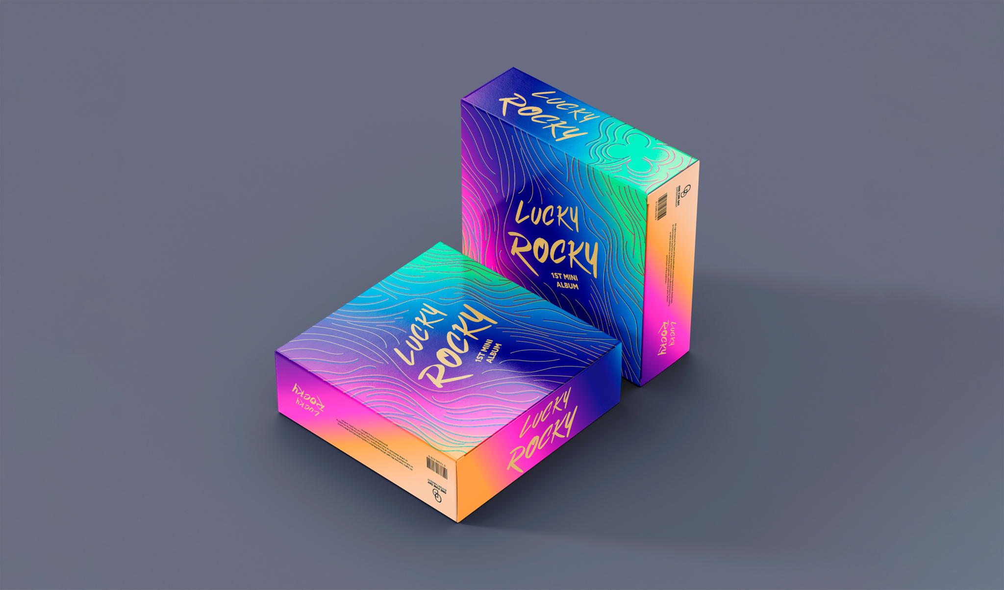
For this music album packaging, I was inspired by the elements of the 70’s and 80’s pop culture.
Using bright and vibrant colors, such as pink, purple, green and yellow that contrast with a darker shade of blue.
I also incorporated curved shapes to create a pattern to symbolize musical rhythm and create a fun visual aspect.
Mixing all of this with a k-pop album format of a box which contains a CD, a photobook, photocards, stickers, etc.

Coffee packaging
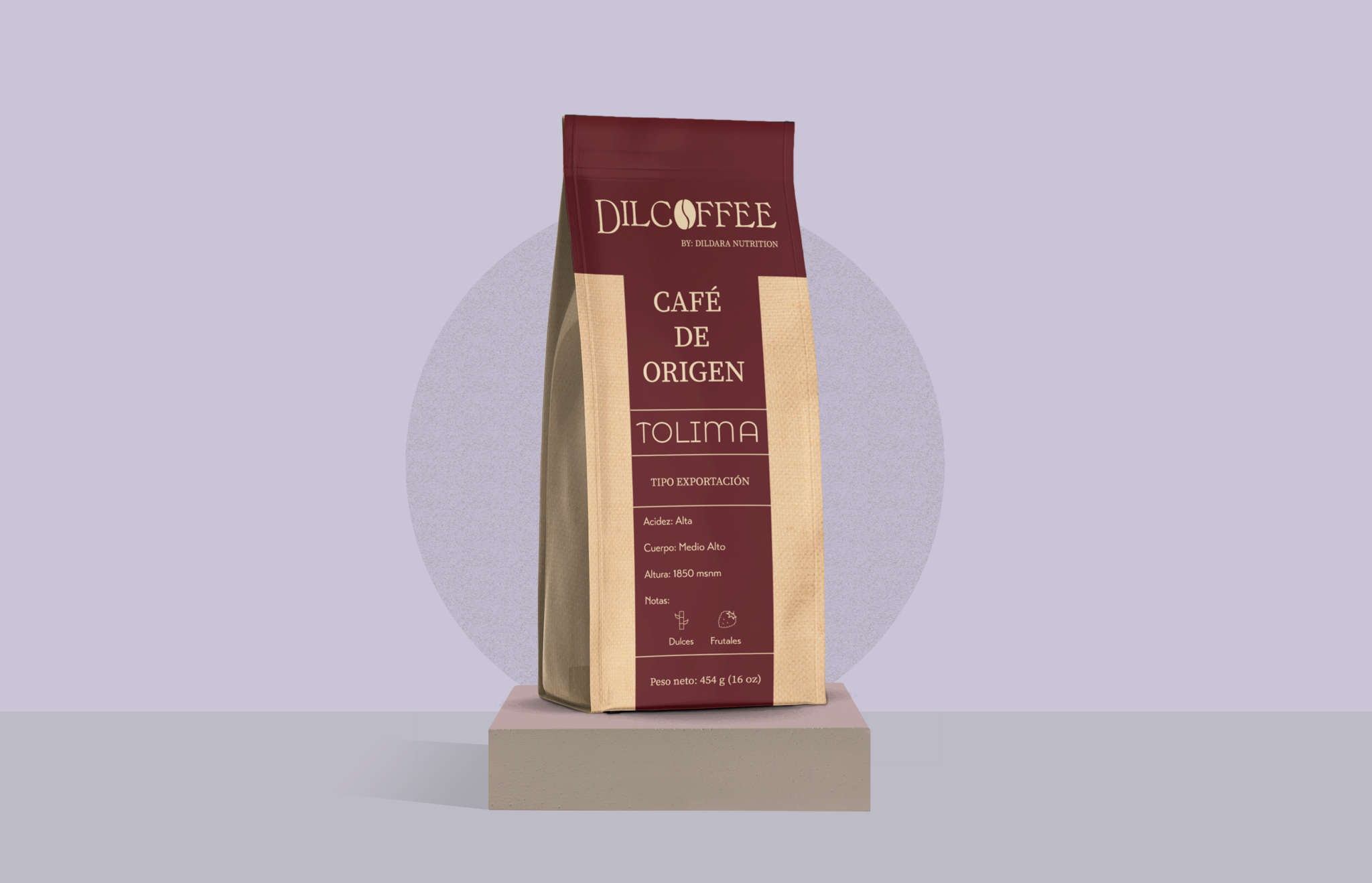
For this coffee packaging design, I wanted to show elegance and tradition.
Using a sober color such as dark red combined with the texture of the traditional jute bulk bags of coffee.
The dark red color conveys the warmth, richness, aroma and flavor of coffee beans.
The texture of the jute bags reflects the quality and sustainability of the coffee, creating a visual contrast.

Sparkling water packaging
This project was made for the subject ‘packaging workshop’ in LCI Bogotá.
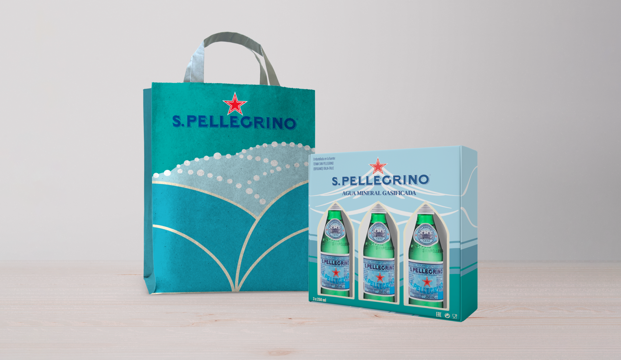
We had to create a tripack and bag proposal for the sparkling water brand S. Pellegrino.
I worked around the concept of the thermal springs where the water originates.
The illustration is inspired by the Art Nouveau style, creating lines that simulate the falling water and circles that represent the gas bubbles.

